Mobile app Signup flow
Improving the signup experience
Background
The project’s objectives are to increase the number of new users and enhance the user signup experience. This will be accomplished by offering a balance between usability and security, enabling customers to finish the signup process quickly and easily. In order to encourage more users to sign up and use the Hunger Swipe app, we are offering a simple and clear signup process.
This is more complex. Just ask the user for an email and password and let people in. One thing I should mention is dropping off between app installation and signups.
Research
To better understand our target audience’s motivations, challenges, behaviors and pain points, I have researched open resources for user signup flows and competitive analysis. Additionally, I have conducted one-on-one interviews with family and friends to uncover user journey problems and their fears and thoughts about signing up for the app. This research will help me to gain in-depth knowledge of our target audience and inform the design of our user signup flow. By taking the time to understand the needs and concerns of users, I can create a signup flow that is intuitive, user-friendly, and effective.

User flow
User flow allow me to understand the target audience and how they are interact with signup flow. It helps me structure and prioritize the information and also to evaluate the user experience.
Findings
The process of setting up an internet account frustrates a lot of people, who frequently give up or abandon it altogether. Users may find this annoying, and a bad user experience may result. In order to retain customers and enhance their experience, it is critical for websites and online services to make creating an account a straightforward and streamlined user experience.
Any online business needs signup forms, but their layout must be carefully considered to prevent user confusion.
Users frequently misunderstand the distinction between signing in and signing up for an online service.
Some users may be concerned about their privacy due to the lengthy nature of the checkout procedure and potential requirement for submitting personal information. Users may become frustrated as a result and decide not to complete their transaction. It is crucial for websites and online services to make the checkout process as quick and easy as possible while simultaneously addressing privacy issues by offering clear information in order to enhance user experience and increase the possibility of completing a purchase.
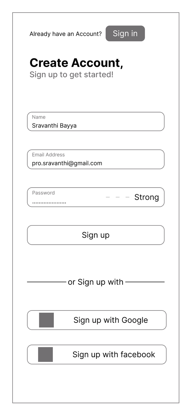
Wireframes

Proper time
Avoid requiring users to create accounts during their initial interactions with an app or website in order to gain their trust. Instead, give users the opportunity to explore the app and become familiar with its capabilities before requesting that they register. Be cognizant of users' time limits as well when asking them to register

One-click registration
Allow users to register and log in through the third-party social media platform by helping them sign in faster

Avoid complex password rules
Security is essential, but don’t turn the creation of passwords stressful for users. Users do have some options for passwords. If password rules are complex, users have a high chance of forgetting them. Make it easy and show them how strong their passwords will be the user's decision to strengthen them

Adaptive place holders
Let users know what they are doing while they sign up. It’s very convenient for the users and saves their time and nerves.
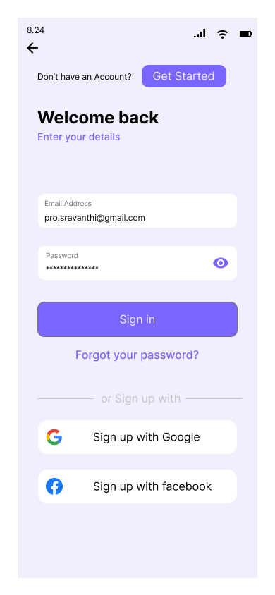
Prototypes
Designed page interactions, to keep the interface as straightforward and user-friendly as possible to improve the user experience. It’s involve deciding when to show a step indication, to help the user understand their current position in a multi-step process. It may also involve deciding when to show a transition screen, such as a loading screen or confirmation message, to provide feedback to the user and help them understand what is happening in the background. Overall, the goal is to create a seamless and enjoyable user experience that helps guide the user through the different steps of the process.


Next Steps
The context and objectives of the process should be taken into account when creating a sign-up flow.I need to improve some more areas to give a better user experience.
Split procedure
Particularly e-commerce sites mix up the information for signing up and checking out. Users must take additional time during registration. Distinguish each step of the registration procedure from one other. Only the questions that are necessary right away should be asked during each engagement.
Guest Access
Allow users to have some functional access before asking them to register. And allow users to purchase without registration. It will help users make one-time purchases or hurry to make a purchase.
Let auto-fill guides
This allows users to be less complicated and avoid mistakes while signing up. Helping them enter data correctly by giving auto-fill for phone input fields, filling in the dashes for the dates, adding slashes, and automatically transitioning from one area to the next.

