

Challenge: Develop the Spanish restaurant food ordering app allows users to order and pick up the wide variety of healthy meals.
Deliverables: User research, User pain points, persona, user journey map, Sitemap, wireframes, Mockups, Prototypes, Accessibility considerations, usability study, Takeaways.
Role: UX/UI designer
The Spanish restaurant food ordering app allows users to order and pick up the wide variety of healthy meals.
Conducting Interviews, paper and digital wireframes, low and high fidelity prototyping, conducting usability studies, accounting for accessibility, iterating on design and responsive design.
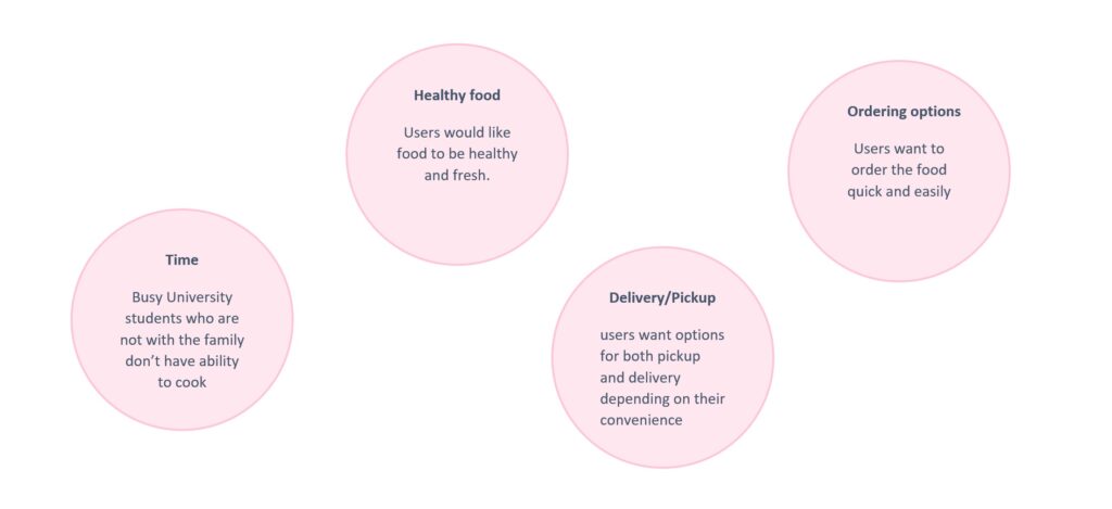
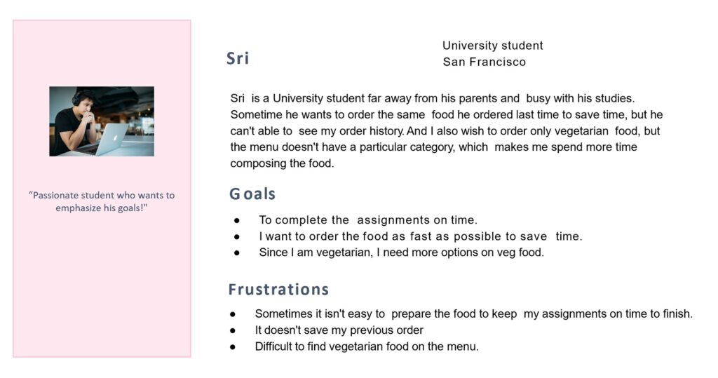
I conducted the interviews and created empathy maps to understand the user’s I’m designing for and their need. The primary user group Identified as working people with family and also Busy university students who don’t have time to cook their meals.
This user group confirmed that initial assumption about The Spanish food Restaurant customers, but researchers also revealed was not only factor limiting the users cooking at home. Other users who want to enjoy and try different cuisine food.
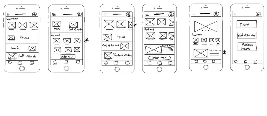
Created couple of paper wireframes to consider how to plan the layout and what elements should be placed.
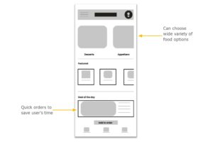
Created these digital wireframes, based on feedback and findings from user research.
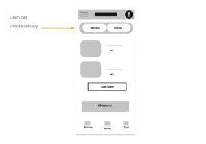
Users also want options for both pickup and delivery depending on their convenience
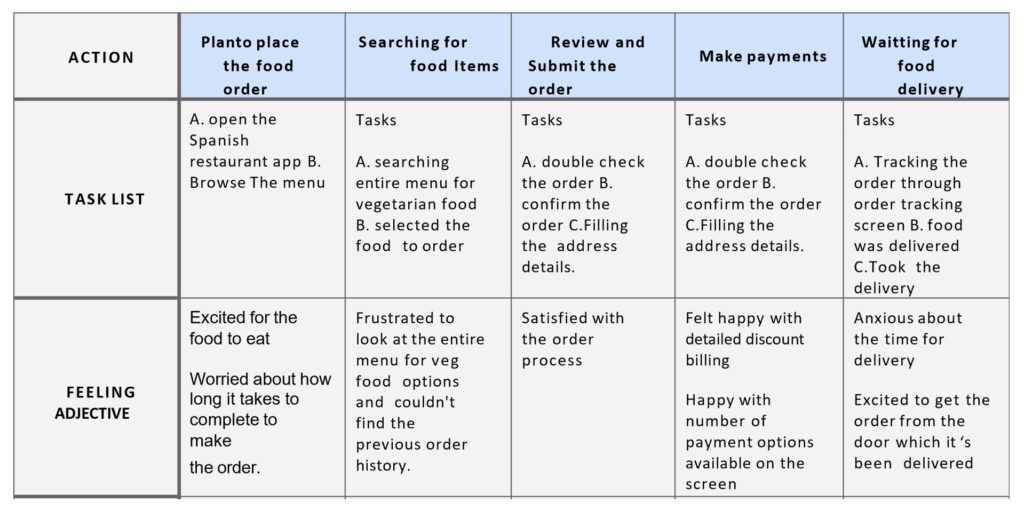
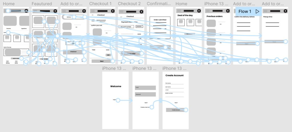
The low- fidelity type connected the user flow to order the Spanish food from the mobile app.
Initially, it allowed some options to order the food quickly, but the usability study found that users want previous orders for a quick process. The second usability study found that delivery options need to be developed. So add the mockup for the delivery option.

The second usability study found that delivery options need to be developed. So add the mockup for the delivery option.
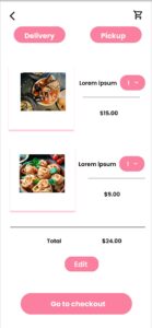
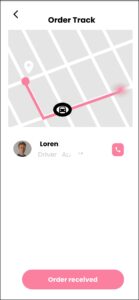
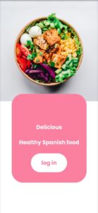
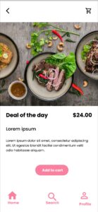

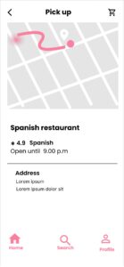
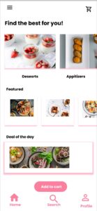
Finally, a High-fidelity prototype with expanded user flow to order the food from the Spanish restaurant.

Provide accessibility by providing a menu with pictures for screen readers
Used icons for easy navigation.
Use a color panel to access for better visibility.
Impact: The Spanish restaurant ordering app makes how easier and quickly they can order the food.
I learned: During the usability study, I learned how to improve the design by considering the user’s priorities.
Next steps
conduct the usability study to know how the user’s r interact through the app to order the food.
Conducting the usability study improved the user’s flow.