Transaction Data Enrichment
Overview
Role and Responsibilities
The goal of Transaction Data Enrichment was to providing transaction enrichment functionality, cleaner visibility on transactions and approval flows for any accounts with in the company and their transactions.
UX Designer and Researcher
User research, Interaction, Visual design, Prototyping and Usability testing.
Pain points
- Does not have the transaction enrichment functionality to provide broader and cleaner visibility on transactions.
- Cardholders does not have the detailed merchant information.
- Does not have the cleaner access of all in one place to look the all the details of the transactions, approvals and disputes.
- Transactions and Expense details are over whelming to the user.
Personas
- Company Program administrator
Administer of a particular company and any accounts with in the company and their transactions.
- Bank Admins
Financial institution administrator responsible to administer any companies and its associated account nad their transactions.
- Reporting Administrator
Responsible to report on a particular company and any acconts winth in the company.
- Cardholder
Responsible for their own business credit card transactions.
Design Process
I Incorporated the Industrial best practices through my UX processes Research, Define, Ideation, Implementation and Testing.
To improve user experience and transaction transparency, enhanced the merchant data for easy accese and layout the data. All users who has access to card transactions will be able to see transaction enrichment with additional merchant details.
- Merchant Details: Merchant name and logo, geographical location of the purchase along with map and additional merchant details for each merchant reference.
- Transaction Details: Should present transaction details from view transaction and view expense screens.
- Enrich Details: This would be optional, who ever opted for this service only will be able to access the data
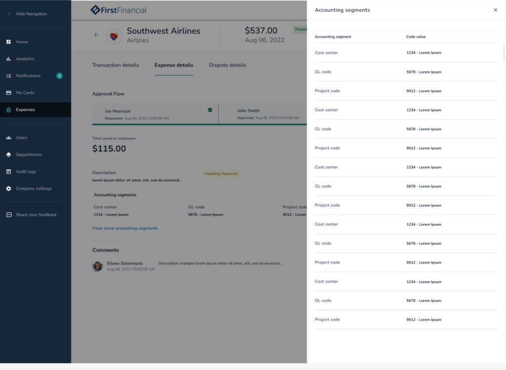
- Expense Details: User can able to look into expense details along with the approval flow to improve the user experience. All the related expense details can able to display along with accounting segments.
- Dispute Details: In case of if the user having dispute can be viewed with status.
The SpendTrack application’s dashboard will exclusively display Level 1 transactions for enhanced clarity. To provide a more comprehensive view of transactions, we have designed the entire row of transaction details to be clickable, revealing enriched data.
Enhancing the user experience, logos have been added to each merchant transaction.
To enhance the clarity of transaction data at levels I, II, and III, presenting all information at once can be overwhelming for users. Consequently, a decision has been made to segregate the data, ensuring clearer visibility. Additionally, card details and status will be displayed upfront in the second header to promptly inform the user.

Displaying enrichment data for transactions, which includes expense details and account segments, has been strategically aligned with the presentation of the approval flow. In instances of disputed transactions, relevant details are also showcased. To enhance user navigation, a tab component has been incorporated featuring three tabs: Transaction Detail, Expense Details, and Dispute Details.
This tab will dynamically display as needed; if the specific transaction includes Level II and III data, expenses, and dispute details.

The upper section of the transaction detail screen features three dynamic quadrants. SpendTrack should showcase the transaction detail screen with three dynamic quadrants.
The upper section of the transaction details screen will consist of two quadrants – the left quadrant for enrichment data fields and the right quadrant for displaying the map upon user request. The bottom quadrant will contain Level II and III data.
Expense details are presented alongside the approval information, featuring convenient ‘Reject’ and ‘Approve’ call-to-action buttons. This allows users to handle approvals without the need to navigate back separately. Additionally, in-depth account data for merchant segments is displayed. If there are numerous merchant segments, a ‘View More’ link is provided, opening a side drawer to present all accounting segments. This approach ensures that the information remains accessible without overwhelming the user with excessive data on the main screen.
Dispute details are showcased along with their status, indicating whether they are closed or open, providing users with clear visibility alongside the corresponding amounts. Users also have the option to view comments explaining the reasons behind a particular dispute


When a user accesses a transaction or an expense, they should have a comprehensive view of the transaction, regardless of the entry point to the transactions.
Mobile Mockups
To maintain a consistent design and avoid user confusion in cases where a particular transaction lacks receipts, an empty illustration has been incorporated to clearly showcase this scenario. This thoughtful design element ensures a uniform and intuitive user experience across transactions, even when no receipts are available.

Conclusion
Upon initial examination of the project, it became apparent that numerous dynamics needed consideration, leading to data overwhelming for users. As I began segregating the data, ideas emerged with a focus on user needs and simpler interactions for better comprehension of enriched data. During the ideation process, the concept of introducing an approval flow surfaced, enhancing the overall user experience.
In the end, the project unfolded as anticipated, with a significant improvement achieved by introducing the tab component, providing a more effective means of representing data. Another notable change to the application was the inclusion of geographical information and maps.

